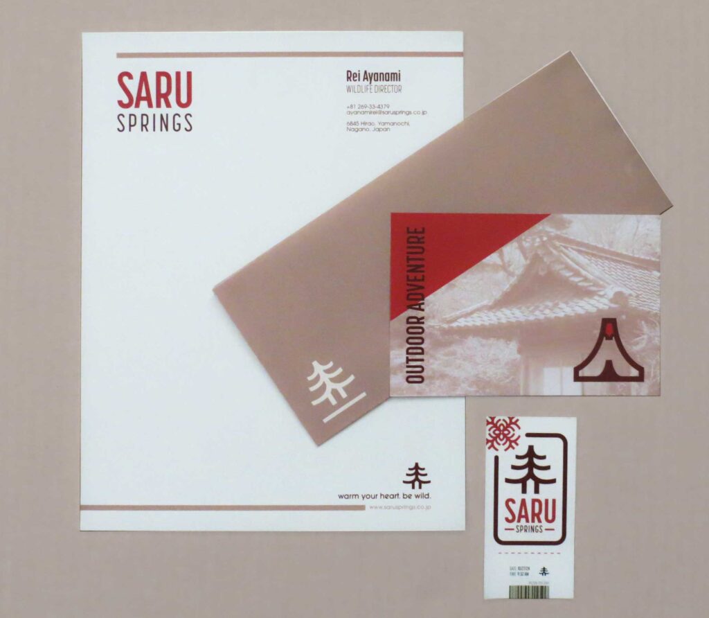
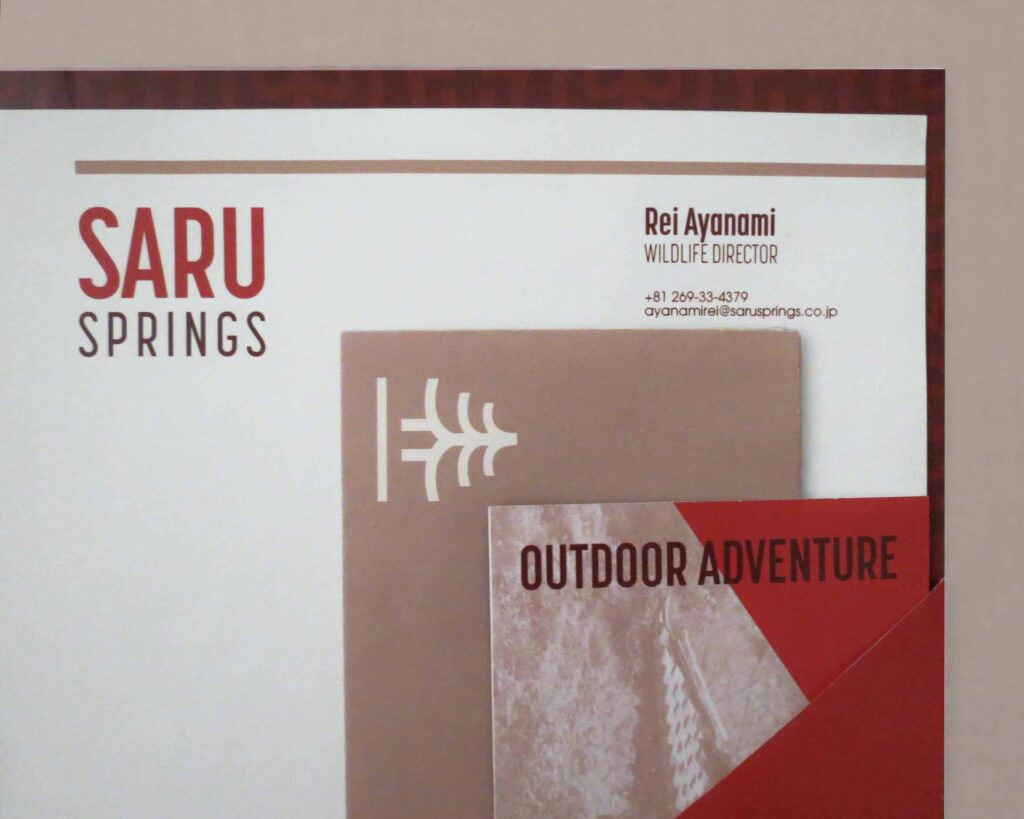
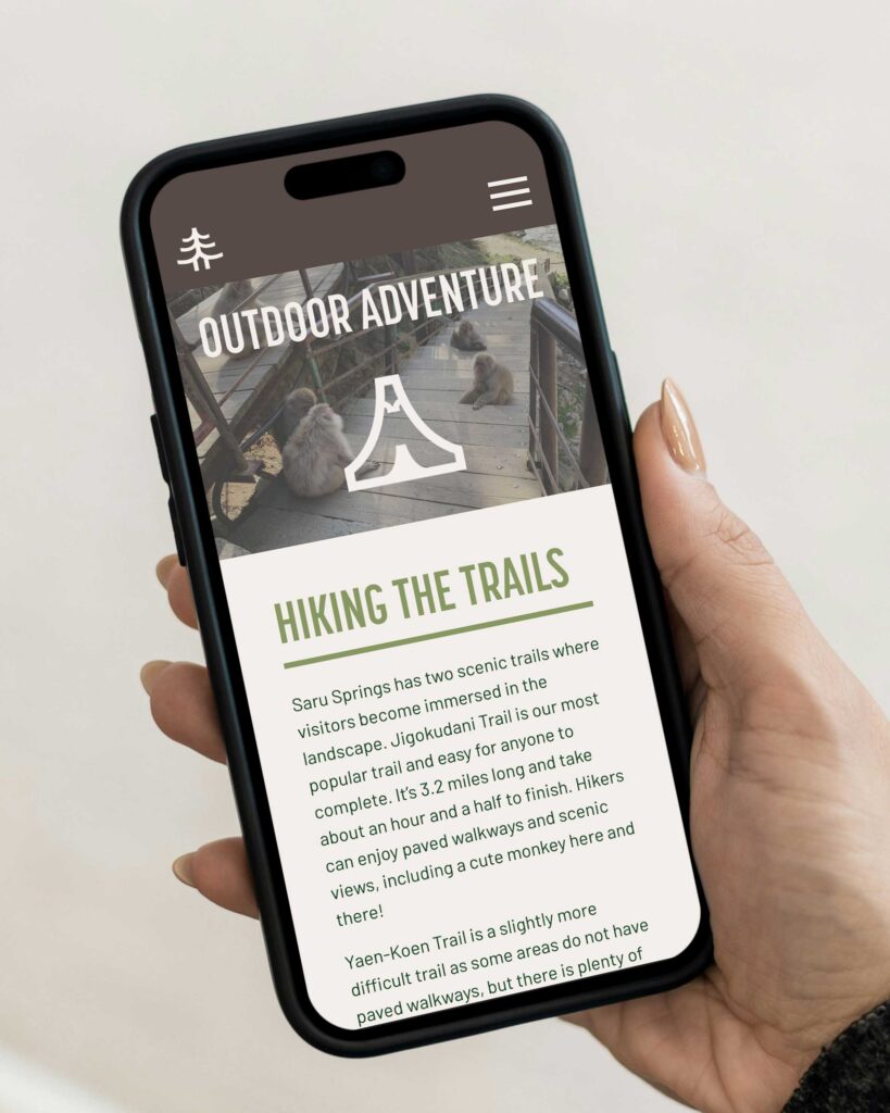
The logomark combines the towering Japanese red pine that cover the Nagano forest and traditional pagoda architecture of temples surrounding the park. A variety of lockups were made to suit all print and online needs.
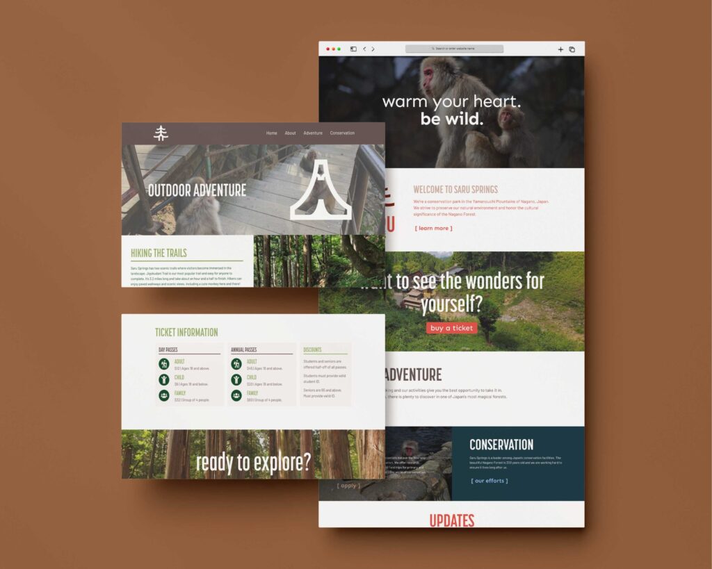
A set of secondary logos represent the park’s divisions: Conservation, Outdoor Adventure, and Sauna Sights. The brand’s color palette expands with these logos, reflecting the natural landscape of the Nagano Forest.